What to Wear for Family Photos: Coordinated, Not Matchy
You've booked your session. You've picked the location. You've wrangled the kids into agreeing. And then someone asks: "So... what are we wearing?"
And suddenly the whole thing feels complicated.
Here's the good news: you don't need to dress like a matching set of paper dolls to look amazing in your family photos. In fact, the families who look the most put-together are almost never wearing identical outfits. They're coordinated — and there's a big difference.
Let me walk you through exactly how to pull it off.
The Golden Rule: Coordinate, Don't Match.
Matching means everyone wears the same color, same style, sometimes even the same shirt. It can look forced, and it tends to make your photos feel more like a school picture day than a genuine portrait of your family.
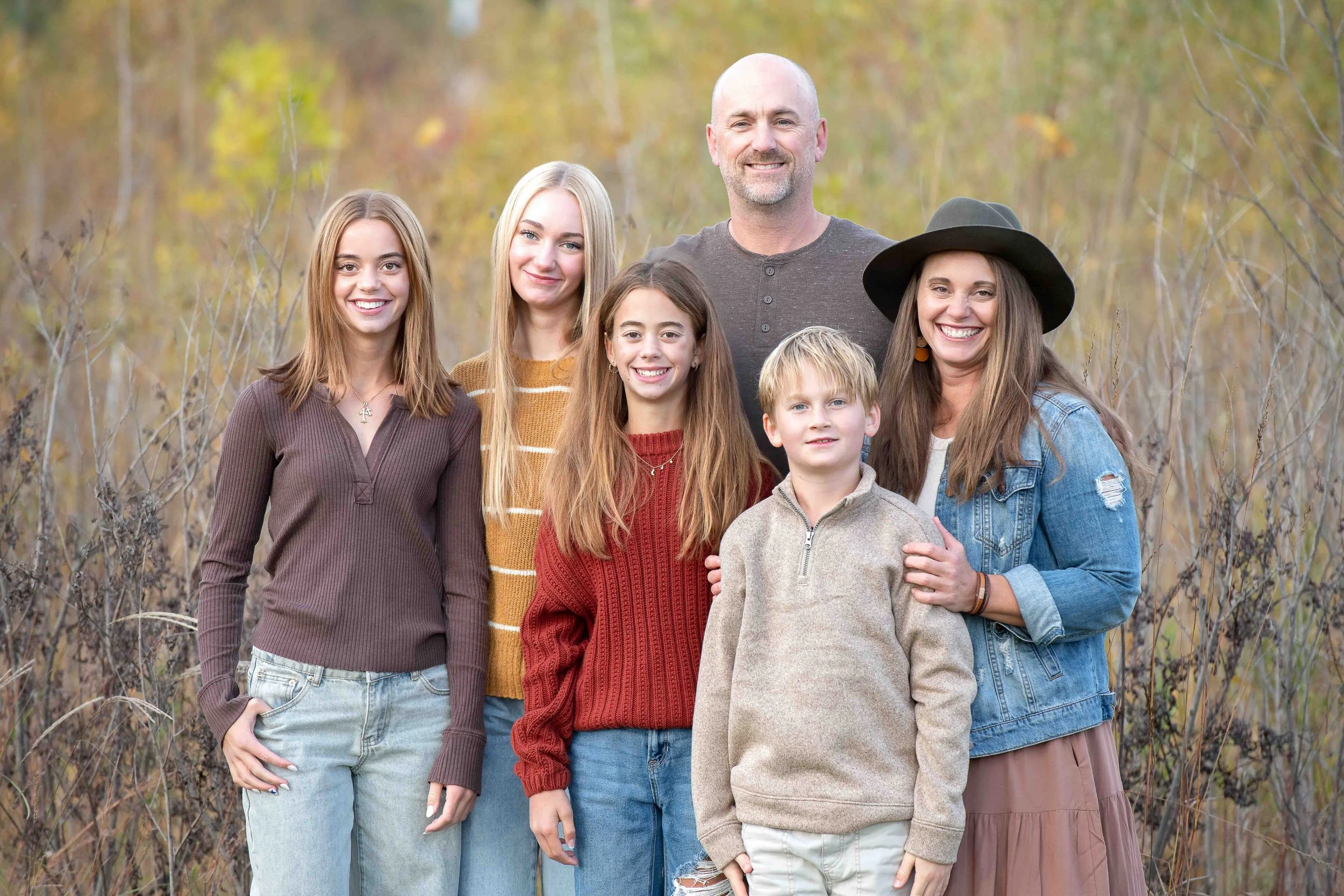
Coordinating means choosing a palette — a small family of colors — and letting each person express their own personality within it. The result feels intentional and harmonious without looking like a costume.
Think of it like a room you love: the couch, the rug, and the throw pillows aren't all the same color, but they go together beautifully
Step 1: Start with One Anchor Piece
The easiest way to build a coordinated look is to start with one person's outfit — usually whoever is hardest to dress, or whoever has the most interesting piece already in their closet — and build everyone else around it.
Mom's floral dress with dusty blue, sage green, and warm cream? There's your palette. Dad gets the sage linen shirt, one kid goes dusty blue, the other gets cream or a soft neutral.
Starting from one anchor piece takes the guesswork out of it completely.
Step 2: Choose a Color Palette (3–4 Colors)
You don't need a ton of colors — you need the right colors in the right proportions. Here are a few palettes that photograph beautifully in West Michigan's natural settings:
Warm Neutrals — cream, caramel, tan, warm white, rust Great for: golden hour fall sessions, beach locations, wooded paths
Cool & Calm — navy, dusty blue, soft grey, white, chambray Great for: lakefront sessions, spring and summer, clean modern backdrops
Earth & Sage — olive, sage green, terracotta, cream, brown Great for: outdoor fall and summer sessions with lush greenery
Jewel Tones — deep burgundy, forest green, plum, mustard Great for: fall foliage, rich autumn color, more formal or dramatic portraits
Avoid neons, super bright primary colors, and large logos or busy graphics — they distract from your faces and your family's connection, which is what the photos are really about.

Step 3: Mix Textures, Not Just Colors
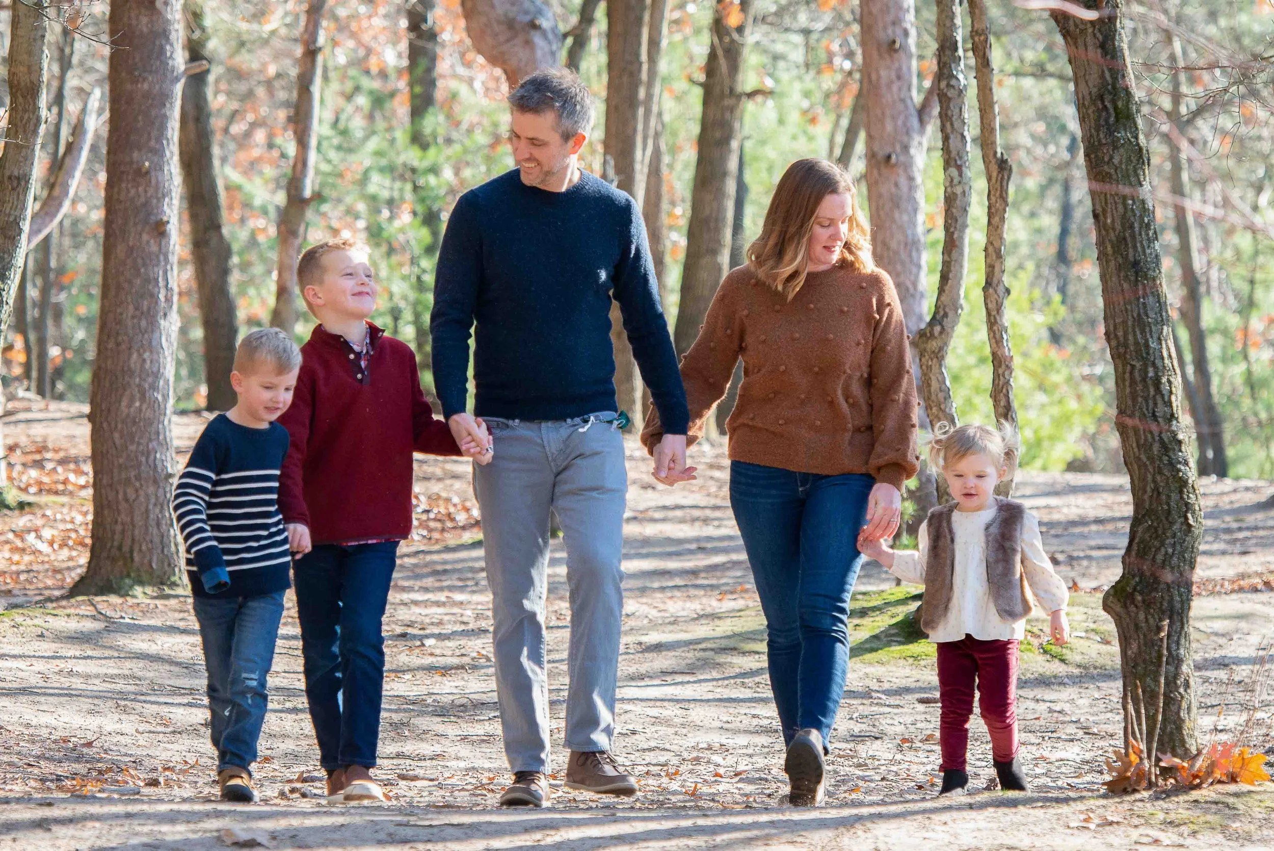
One of the secrets to photos that look expensive and intentional is texture. When everyone's wearing flat, smooth fabrics, the image can feel flat too. But layer in a denim jacket, a chunky knit sweater, a flowy linen dress, or a flannel shirt — and suddenly the photo has depth and richness.
Some textures that photograph beautifully:
Linen and chambray (relaxed, natural)
Chunky knit sweaters and cardigans (perfect for fall)
Flowy chiffon or maxi dresses (great movement and elegance)
Denim (casual and timeless — don't underestimate a good jean jacket)
Flannel and plaid (as a single piece, not on everyone)

Step 4: Vary the Silhouettes
Not everyone needs to be in jeans and a shirt. Not everyone needs to be dressed up. Varying the silhouette — a dress, pants, a skirt, casual shorts — adds visual interest and makes the photo feel more dynamic.
If Mom is in a flowy maxi dress, Dad doesn't have to be in a suit — a well-fitted casual button-down and dark chinos works perfectly. Let the kids have a little personality too. A little boy in suspenders or a little girl in a twirl-worthy dress can make a photo unforgettable.

Step 5: Think About Where You'll Be
The setting matters more than most people realize. If we're shooting at a West Michigan beach or along the lakeshore, light, airy colors photograph beautifully. If we're in the woods or a park with lots of deep green, richer jewel tones and warm neutrals pop.
When you book your session with me, I'm always happy to help you think through the location and what will complement it best. That's part of the process.
What to Avoid
Matching outfits — they almost always look stiffer than you expect
Bright white on everyone — one white piece is great; all white tends to blow out
Large logos and graphics — they date quickly and pull focus
Busy, clashing patterns — one pattern in the group is great; two or more gets chaotic
Uncomfortable clothes — if the kids hate it or Dad keeps pulling at his collar, it shows up in the photo
A Few Practical Tips
Shop your closet first. You probably already own more of the right pieces than you think. Lay everything out on the bed before you go shopping.
Bring a change for the kids. Little ones are magnets for spills, grass stains, and ice cream. Pack a backup outfit.
Dress one level up from casual. If your family is naturally casual, dress like you're going to a nice dinner — not a gala. You want to look like you, just your best you.
Don't forget shoes. Shoes are in a surprising number of family photos, especially when little kids are involved. White tennis shoes can stick out in an otherwise warm, earthy palette. Think it through.
Ready to Book?
Wardrobe is just one piece of the puzzle — and I promise it's less stressful than it sounds once you have a plan. I walk every family through this before our session so you can show up feeling confident and ready.
→ Book your Glerum Photography family session today
Have a wardrobe question before you book? Reach out — I'm always happy to help you plan.